by Rick Poynor
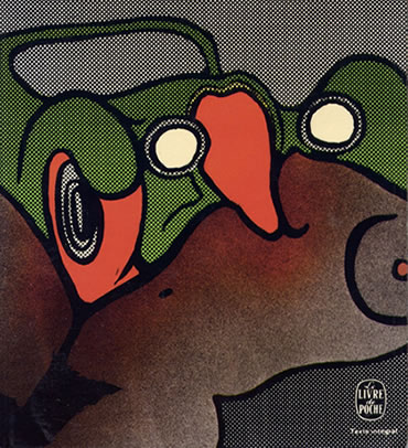
‘Missing the point’: (detail, Livre de Poche edition, 1973; design: Atelier Pascal Vercken).
NOTE: This is an edited version of an essay published in Designing Pornotopia: Travels in Visual Culture
J. G. BALLARD’S Crash tests the limits of the reader’s taste and sympathies in the most profound ways and it has always provoked strong reactions – positive and negative. British novelist Will Self has said, ‘I only have to look at a few paragraphs of Crash to feel I am in the presence of an extreme mind, a mind at the limits of dark imagination.’ He meant this as a commendation. Even Ballard sometimes seemed ambivalent. ‘How many people are there who’d want to read a book like Crash?’ he once asked. ‘Not many.’
Yet Crash, described by Ballard himself as a ‘psychopathic hymn’, did find a following. Over the years it has appeared in French, German, Italian, Dutch, Spanish, Portuguese, Greek, Finnish, and Japanese translations. It became a cult book, appealing to the kind of reader who also liked William Burroughs — the type of novel a post-punk rock band might enthuse about in the music press.
I read the hardback first edition of Crash as a teenager, soon after it came out. I was already a devotee of Ballard’s other books, but I loved Crash’s extremity, its sense of moral danger, its willingness to probe dark areas of the psyche, and the toxic beauty of its prose. Over the years I collected editions of the book, partly to see whether any publisher could ever visualise a piece of writing which is prepared to be, in Ballard’s words, ‘openly pornographic’ as a literary stratagem. On the whole, though, image-makers have been defeated by Crash. A book that ought to have inspired covers to match and reflect its status as an underground classic has often received visual treatments marked by incomprehension and evasion. I was curious to know how Ballard viewed this, as a writer with such a strong sense of the visual. He didn’t wish to be interviewed – reviewing the covers would, he suggested, be ‘rather too close to an autopsy on myself’ – but he was willing to make notes on some of them if I sent him photocopies.

LEFT: Crash’s first jacket, designed by Bill Botton (Jonathan Cape, 1973).
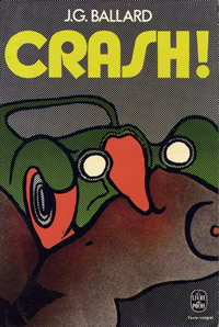
RIGHT: Chris Foss’s interpretation (Panther, 1975).
The first jacket, published by Jonathan Cape in 1973, shows a jutting gear stick, presumably intended to be phallic, in front of a towering three-dimensional titlepiece that occupies most of the cover. This still rankles with Ballard, who describes it as ‘monstrously bad, one of the worst book jackets ever – for sheer ugliness and crudity, impossible to beat’. Few of the Ballard hardback covers produced by Cape in the 1970s and early 1980s were any good. The first UK paperback edition of Crash, however, illustrated by science fiction artist Chris Foss, retains its power. ‘Superb, in many ways the best ever,’ notes Ballard. ‘Quasi-realistic, but in the right way, like a movie poster of the 1950s – brought into brilliant focus by that line – “A brutal, erotic novel”.’ Foss, an illustrator of The Joy of Sex

LEFT: Fashionable flirtations (illustration: James Marsh; Triad, 1985).
RIGHT: ‘Too lipsticky; too neat’. (illustration: Larry Rostant; Flamingo, 1993).
In 1985, the novel was reissued as part of a new, oppressively black-bordered series with an illustration by James Marsh, showing a red-lipped Amazon at the wheel, clad in studded leather. This connected the book with emerging trends in fetish clothing and a fashionable flirtation with S&M, but it had nothing to do with Ballard’s vision. By 1993, the woman was reduced to a pair of pouting red lips framed by a shattered rear view mirror – it resembled the kind of airbrush illustration in vogue 20 years earlier. Ballard dismisses the cover as ‘too lipsticky – too “neat”.’
LEFT: Livre de Poche again, for your pleasure… (1973; design: Atelier Pascal Vercken).
Ballard’s 1974 introduction, which might have offered additional clues for visual interpretation, is reprinted in both editions. Crash, he writes, is ‘an extreme metaphor for an extreme situation, a kit of desperate measures only for use in an extreme crisis. . . . Will modern technology provide us with hitherto undreamed-of means for tapping our psychopathologies?’ Neither cover shows any hint of these concerns. The tacky Livre de Poche edition, in which a car’s radiator grille metamorphoses into a flesh-licking tongue, once again turns the vehicle itself into the protagonist and misses the point.
Where interpretations of Crash by male image-makers tend to present female sexual personae in the most obvious and unrevealing ways, as victim or vamp, missing the unbridled perversity of the book’s female characters, women designers and image-makers have been inclined to neutralise the book’s violent eroticism.

LEFT: Crash in the desert (design: Carin Goldberg; Vintage, 1985).
RIGHT: Ecstasy in the fairground (photograph: Clare Godfrey; Vintage, 1995).
A 1985 US paperback, designed by Carin Goldberg, with wide-spaced ‘new wave’ typography, arbitrarily transplants Crash to the American desert, where a faceless female who looks like a misplaced fashion model wanders away from some totemic car parts scattered in the dust. The cover’s Surrealism-lite bears only the most tenuous connection to the novel. Photographer Clare Godfrey’s cover image for the 1995 UK edition treats Crash as a kind of ecstatic fairground ride. The hot neon colours and chaotic superimpositions relate to a scene in which Vaughan and the narrator cruise the expressways while under the influence of LSD, but the image is strangely depopulated and Crash’s relentless sexual content is suppressed.
Crash is peculiarly resistant to attempts to summarise it with a single image. Its synthetic literary method depends on the conjunction within a verbal image of phenomena that are usually discrete. Ballard insistently establishes geometrical relationships between the body parts and postures of his characters and the technology that surrounds them: ‘By entering her vagina among the metal cabinets and white cables of the X-ray department I would somehow conjure back her husband from the dead, from the conjunction of her left armpit and the chromium camera stand, from the marriage of our genitalia and the elegantly tooled lens shroud.’ In the late 1980s, collage and montage became increasingly prevalent means of expressing thematic complexity on book covers. If ever a novel called out for a mode of evocation based on fragments and juxtaposition, it was Crash, but it was 1994 before an American design team explored this possibility.
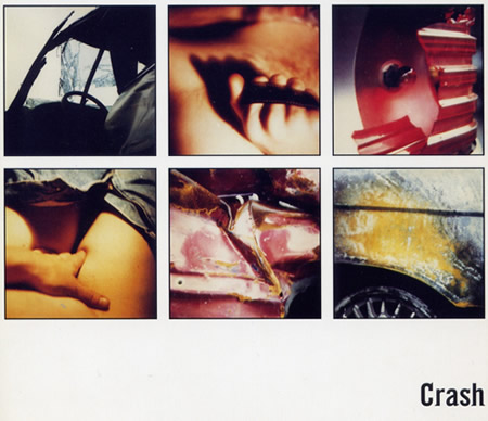
‘Both sexes, equally implicated’ (detail, Noonday Press edition, 1994; design: Michael Ian Kaye and Melissa Hayden).
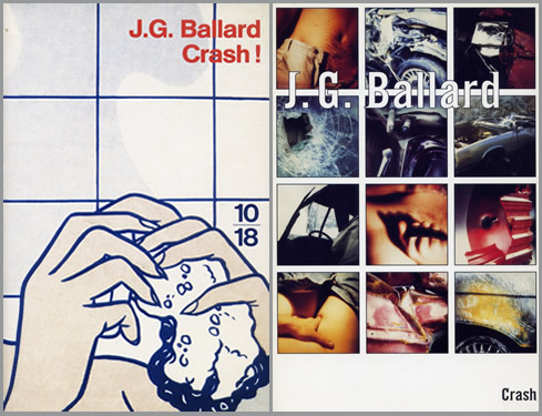
Michael Ian Kaye and Melissa Hayden’s cover for Noonday Press makes Crash look like the cult novel that it is. ‘I loved the book,’ says Kaye. ‘It was so much about cars and sex that it seemed stupid to hide that. We went to a junkyard. We were both really into this project.’ Hayden’s boyfriend was also involved in the shoot and, for once, both sexes are presented as equally implicated in Ballard’s nightmare marriage of technology and desire. It was Hayden’s photographic concept, but at the junkyard they passed around a Polaroid. The grid of 12 pictures on the cover shows smashed and crumpled bodywork, a hand clutching a roll of film, a man’s jeans open at the fly with the suggestion of an erection and a woman’s hand delving for her crotch. A glimpse of breasts or buttocks can be seen through a broken windshield. ‘They all represent little blips of the experience,’ says Kaye. ‘Using the grid speaks a little more to the futuristic quality without being so literal. It was about lots of little ideas making up the whole.’ The ‘garage font’ title typeface, a sans serif to which serifs have been applied selectively, adds to the mood of unease. With cult-like understatement, Kaye positions the title in the bottom right-hand corner as a kind of full point to the design.
Ballard had never seen this version of Crash until I sent it to him. Publishers do not always provide authors with copies of foreign editions. He found the cinematic treatment ‘a bit too literal – if the novel is a psychotic hymn, this hardly suggests it’. But then no cover has succeeded in fully expressing the delirium of Crash.
 LEFT: Another miss (Vintage, 1996; cover photography © Alliance).
The 1996 UK film tie-in version, which Ballard, a supporter of Cronenberg’s interpretation, does admire, was another missed opportunity. The cover is based on a scene showing actress Holly Hunter (Helen Remington) straddling James Spader (James Ballard) in the front seat of a car. While the image conveys nothing of the perversity of either book or film and only hints at the role of the car, it does carry an erotic charge, acknowledging sexual interaction as the book’s subject in a way that few Crash covers have dared.
The cautious handling of Crash, even now, is all the more surprising when one considers the prevalence of pornographic imagery in contemporary culture. As a work of bizarre prophecy, the book was far enough ahead of its time to be truly shocking, though only a fool would imagine that Ballard thought we should crash our cars for sexual thrills. The phenomenon and meaning of the collision has become the subject of cultural criticism in essay collections such as Car Crash Culture (2001) and Crash Cultures (2003), and the spectre of Ballard’s narrative invariably haunts their pages. Crash’s explosive collisions of flesh and metal are, as Ballard says, a metaphor, taking social tendencies and following their trajectories to discover where they might lead. In his introduction, he notes that ‘we live in an almost infantile world where any demand, any possibility, whether for life-styles, travel, sexual roles and identities, can be satisfied instantly’. If that was true in 1973, it is even more the case today. At the time, Ballard described the book as ‘cautionary’ and ‘a warning’, but he has wavered on the question of whether Crash is a moral indictment. In 1997, he told cultural critic Mark Dery that the novel illustrates the process by which ‘formerly aberrant or psychopathic behavior is annexed into the area of the acceptable’ and he pointed out how the proliferation of new communications technologies was aiding this process.
In December 2003, GQ ran a story about ‘dogging’, a sexual subculture in which people use the Internet to arrange meetings where they have sex in parked cars while others watch. The item was illustrated by the Hunter and Spader shot used on the cover of Crash.
Rick Poynor
..:: MORE CRASH COVERS FROM RICK POYNOR’S COLLECTION
Above…
LEFT: Bruna Dutch edition (1980; design: Kothuis Art-Team).
RIGHT: Minotauro Spanish edition (1980; design uncredited).
Above…
LEFT: 10/18 French edition (1992; detail from Roy Lichtenstein’s Woman in bath).
RIGHT: Noonday Press US edition (1994; design: Michael Ian Kaye and Melissa Hayden).
Above…
LEFT: Picador USA edition (2000; design: Henry Sene Yee; painting: Davin Watne).
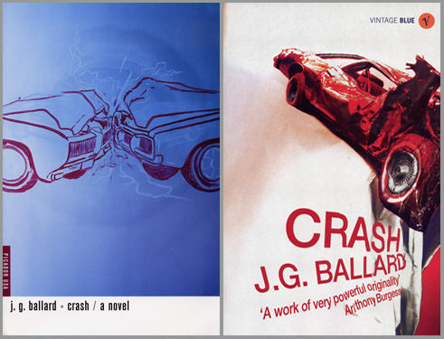
RIGHT: Vintage Blue UK edition (2004; photograph Scott Wishart; designer uncredited).
Rick Poynor was founding editor of Eye magazine in London from 1990 to 1997. He writes columns for Eye and for Print magazine in New York, and he has covered design, media and visual culture for Blueprint, Frieze, I.D., Icon, Domus, Metropolis, Adbusters, Harvard Design Magazine, The Guardian, Financial Times, and many other publications. His books include No More Rules: Graphic Design and Postmodernism (2003) and the essay collections Design Without Boundaries (1998), Obey the Giant: Life in the Image World (2001) and Designing Pornotopia (2006). In 2003, he co-founded www.designobserver.com, now a leading weblog for design discussion. He is a research fellow at the Royal College of Art in London, and he lectures widely in Europe, the US, Australia and China.
..:: MORE INFO
+ ‘Woefully Underconceptualised’: Rick McGrath on J.G. Ballard Cover Art
+ Rick McGrath’s Terminal Collection
+ Ballardia: Jeremy Dennis’s JGB Cover Art Gallery
+ Mike Holliday’s guide to collecting Ballard